
Team Sports
Monitoring Kawhi’s Anaerobic Energy Levels
An emerging field of sports science is load and fatigue management. Many coaches receive information like the amount of distance and number of sprint players ran during games and practices. Although they seem like good information to pass along from our perspective, what are coaches supposed to do with the information?!
A better practical approach is to minimize the scientific rational, background, and jargon, when we talk to coaches; instead, let’s tell them what they need to know, let’s tell them the bottom line.
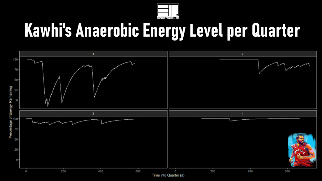
In the photo, a coach can very clearly see that Kawhi Leonard expanded tons of his anaerobic energy in the first quarter. With this information, he can review game-tape to understand how his playing tactics affected Kawhi so starkly. The coach will also see that with his change in playing tactics, Kawhi was able to maintain a good amount of energy for bursts of speed in the rest of the game.
The graphs are intuitive – they are easy to read and to follow. Coaches don’t need to know anything more than what is shown.
This work was based on a 2018 NBA tracking data that is publicly available, and was done together with a good friend and colleague of mine, Aaron Pearson (@aaronzpearson).
Using GPS Data to Quantify Energy Levels
How anaerobic energy level was calculated above, and where this can lead us in the near future?
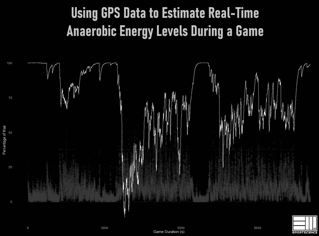
This graph shows a soccer player’s anaerobic energy levels (white line) during a game, from warm-up to cool-down in relation to his speed (grey dots). Coaches looking at this plot can very quickly see how hard the player worked during the first and second halves of the game.
But how do we get these values? The short answer is the D’ balance model, which estimates how much anaerobic energy athletes have in their reserve at any given time. This type of energy does not require oxygen for production and is used very quickly (typically within 1-2 minutes of hard running).
While advancements in athlete fitness testing allows us to measure metrics like lactate threshold, VO2 max, maximal aerobic speed, etc. on the field, rather than in the lab, we went even further and found a way to estimate critical velocity (the fastest speed you can run indefinitely -theoretically- using GPS data). Critical velocity is defined as the point where our bodies use anaerobic energy at the same rate as it is replenished.
From critical velocity calculation, we were able to calculate D’, which is the amount of anaerobic energy. How? Put simply, if you were to run as hard as you can, D’ is the distance you ran until you reached critical velocity. Values for D’ typically ranges between 100 to 300 meters. From there, we were able to calculate how quickly athletes used their energy levels in relation to how much faster they were running above critical velocity.
This is an imperfect science and is being worked on. On this graph you can see that the athlete used more energy than we calculated was possible. This could be due to better athlete preparation, miscalculations, or a myriad of other factors. With time, we will refine our techniques and provide coaches with more accurate information. For now, this is a great start!